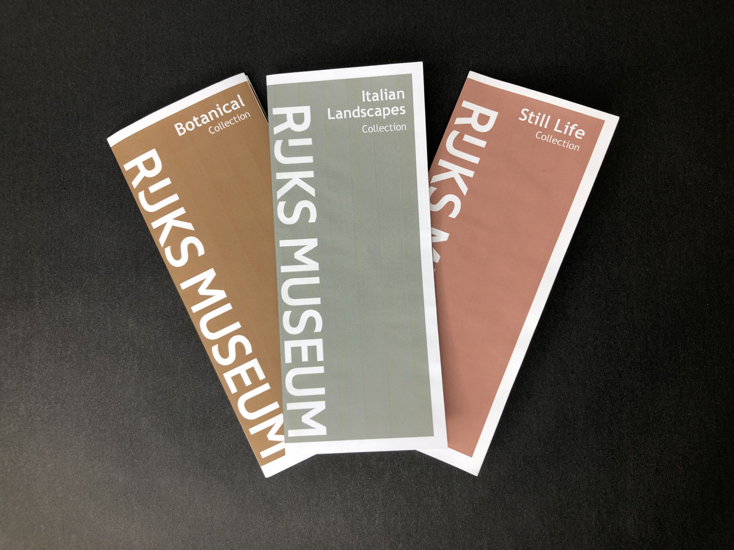
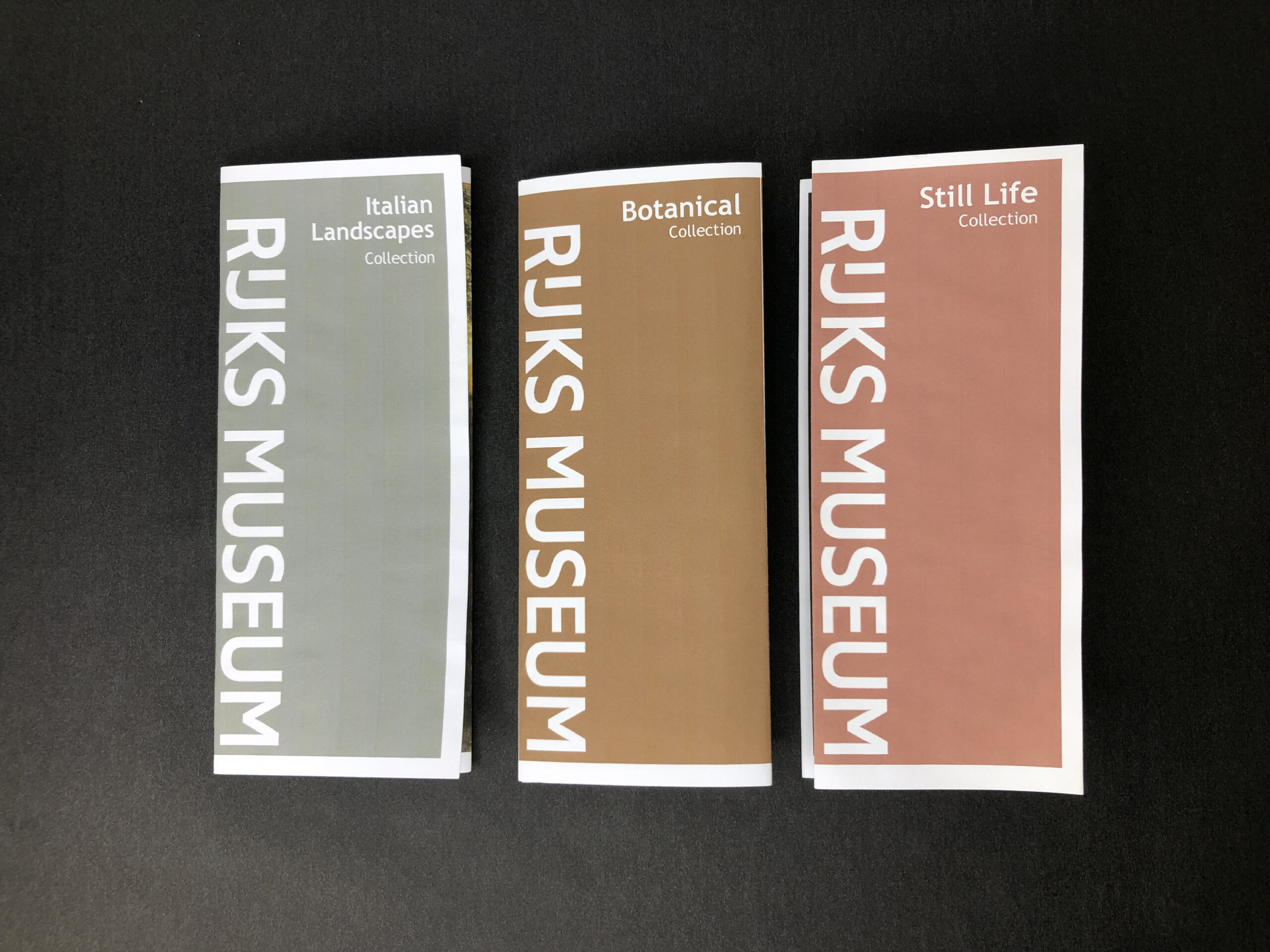
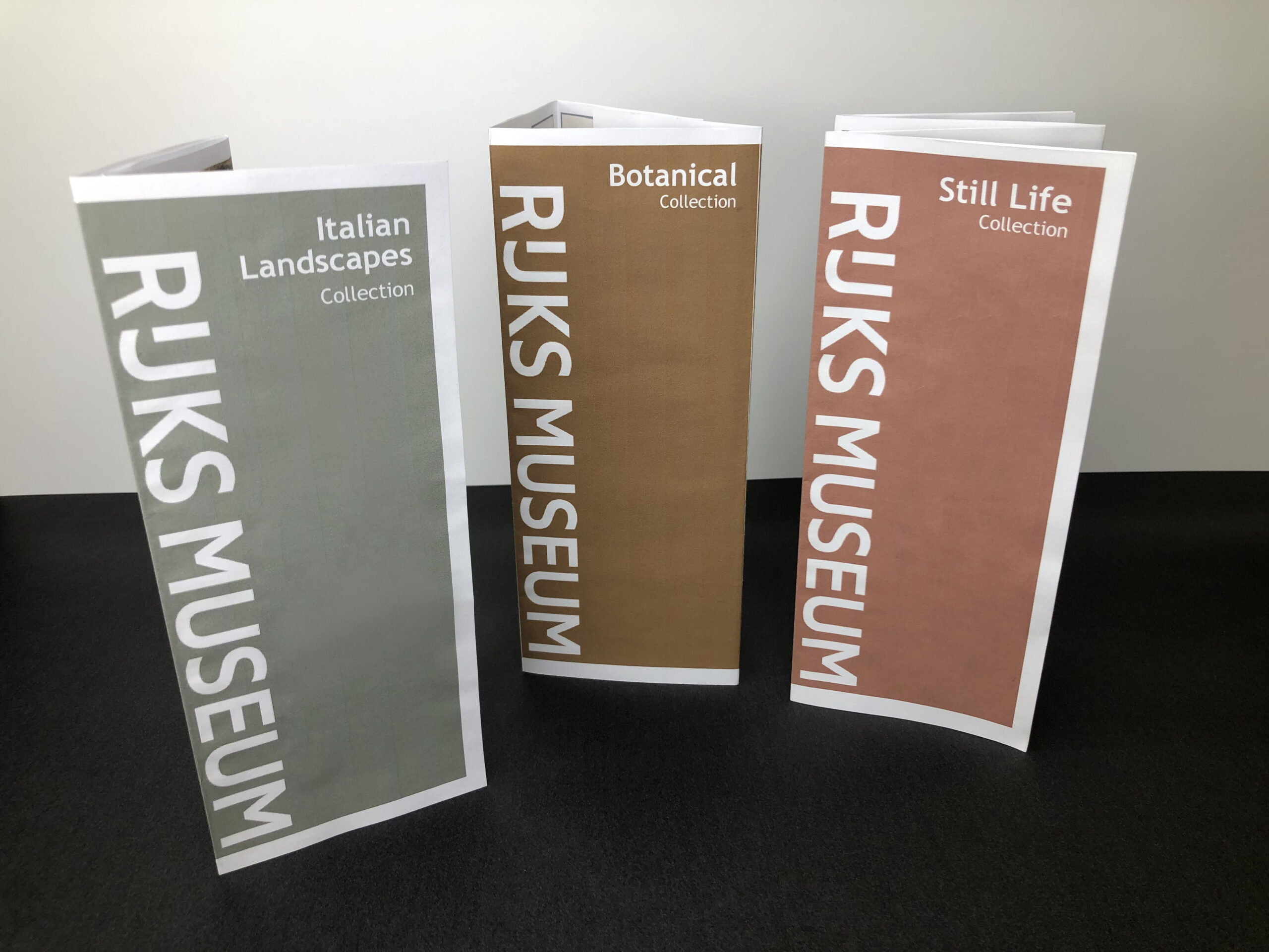
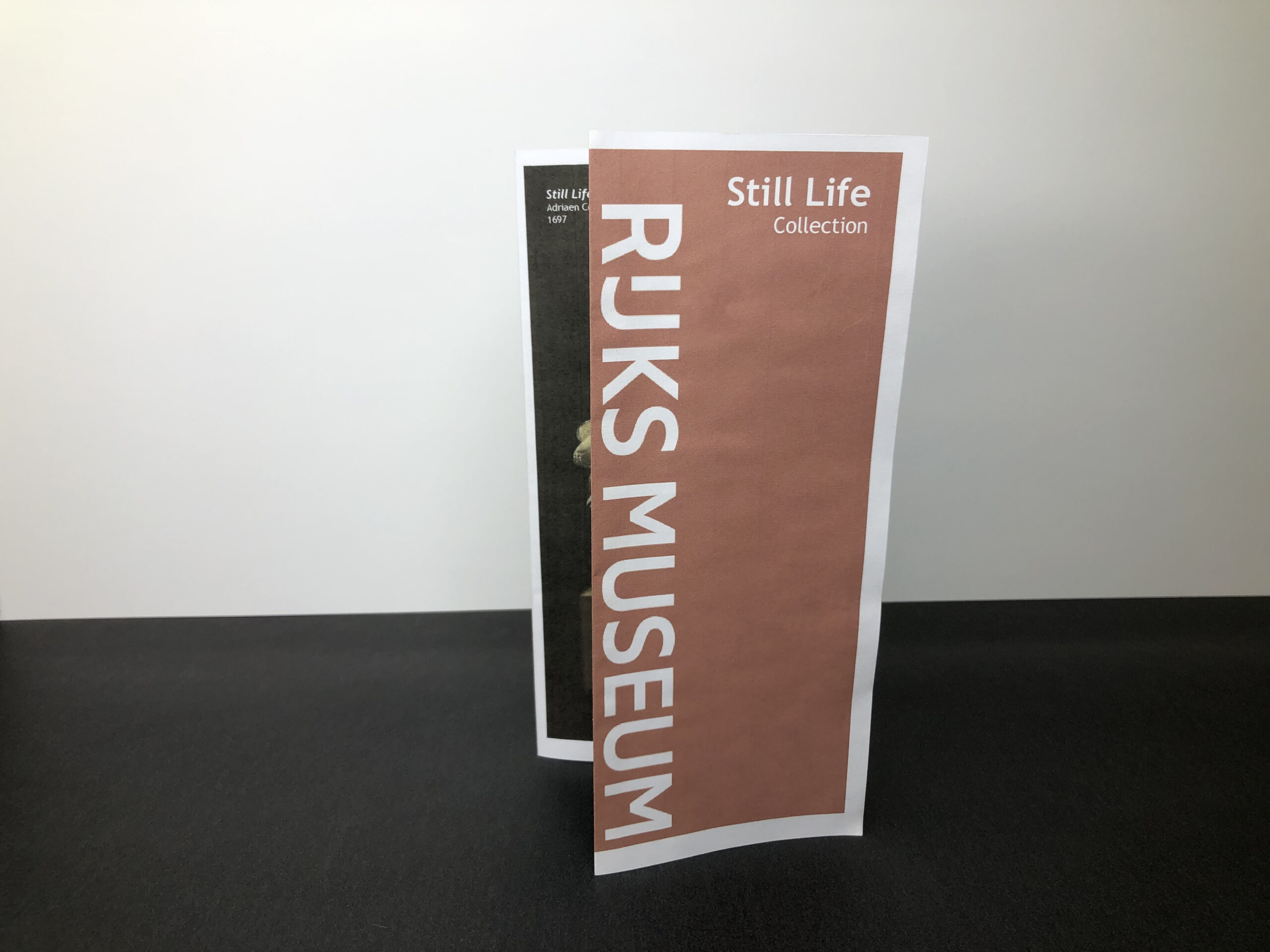
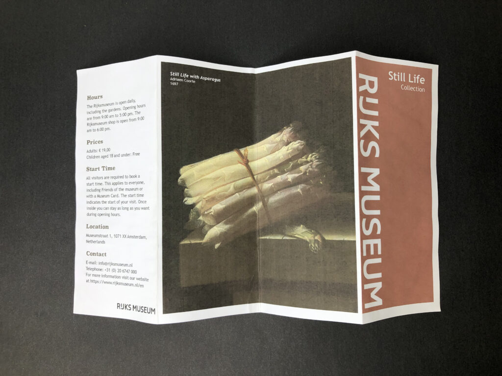

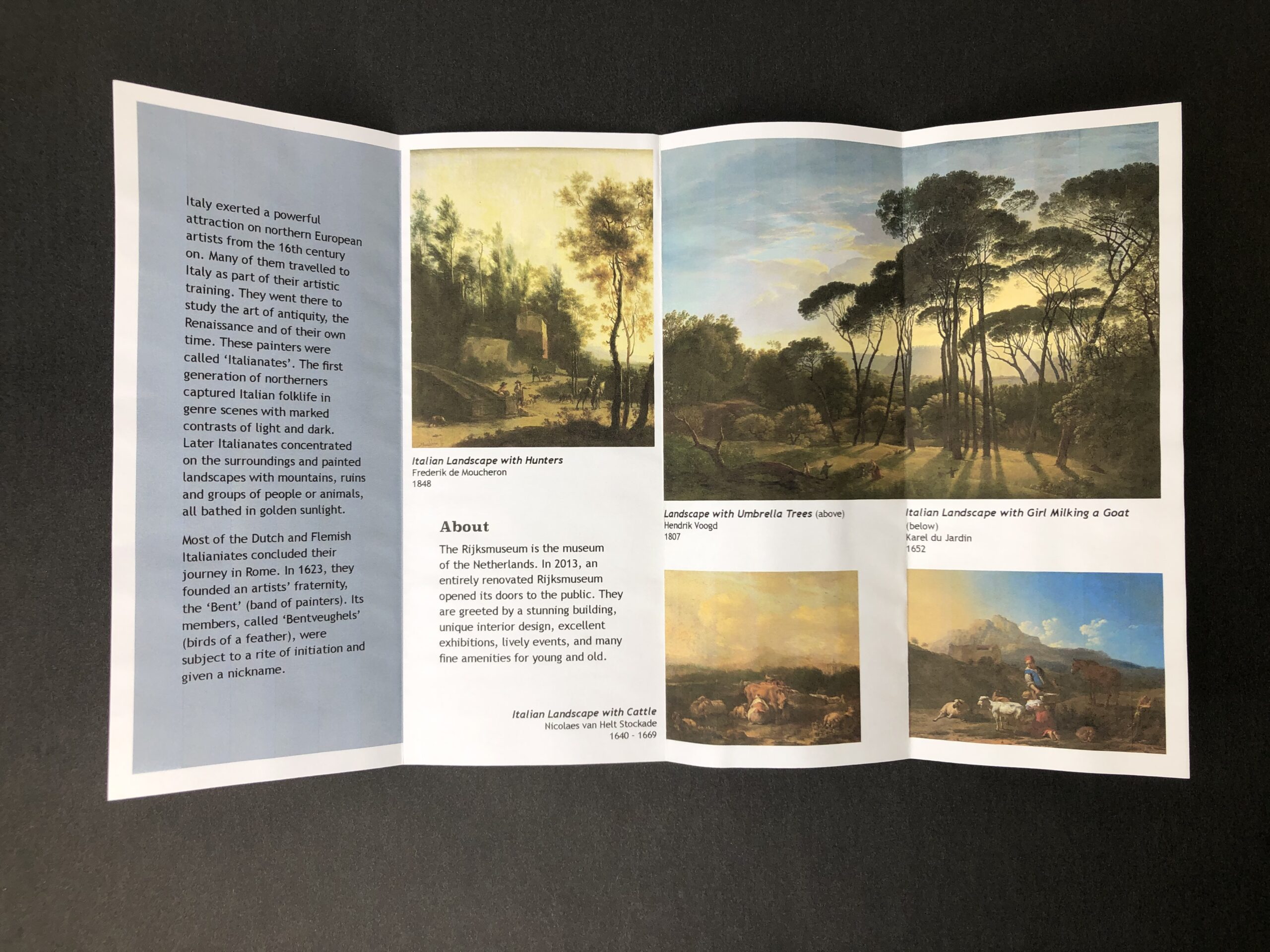
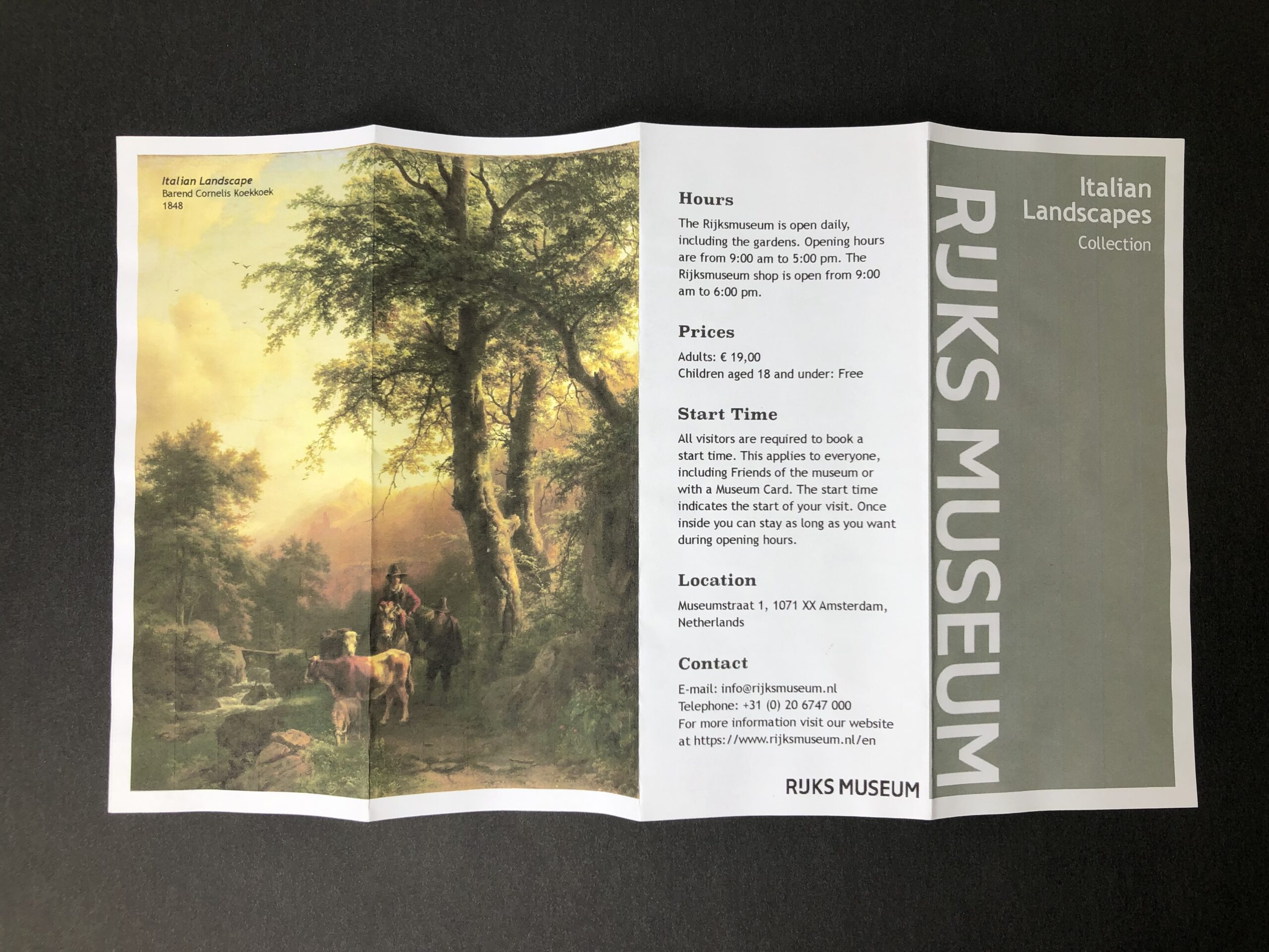
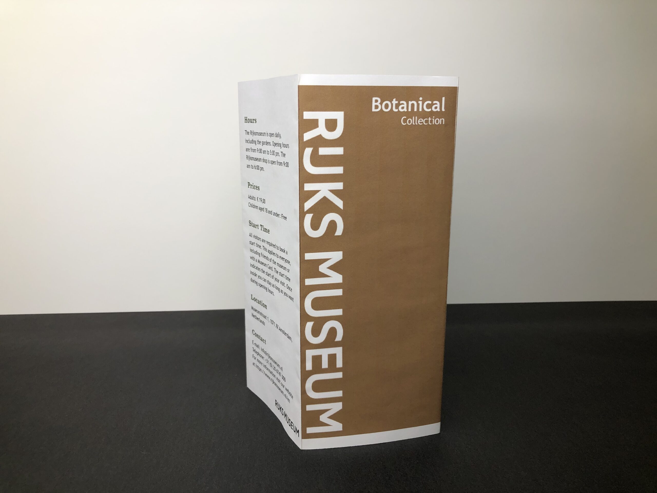
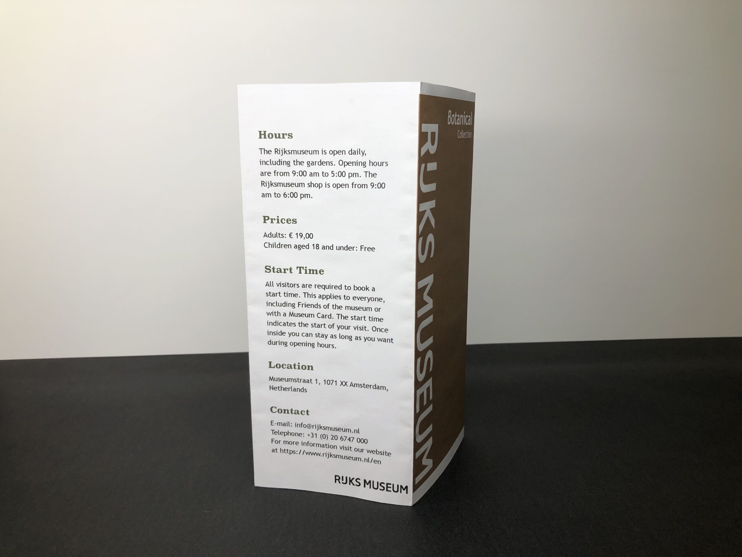
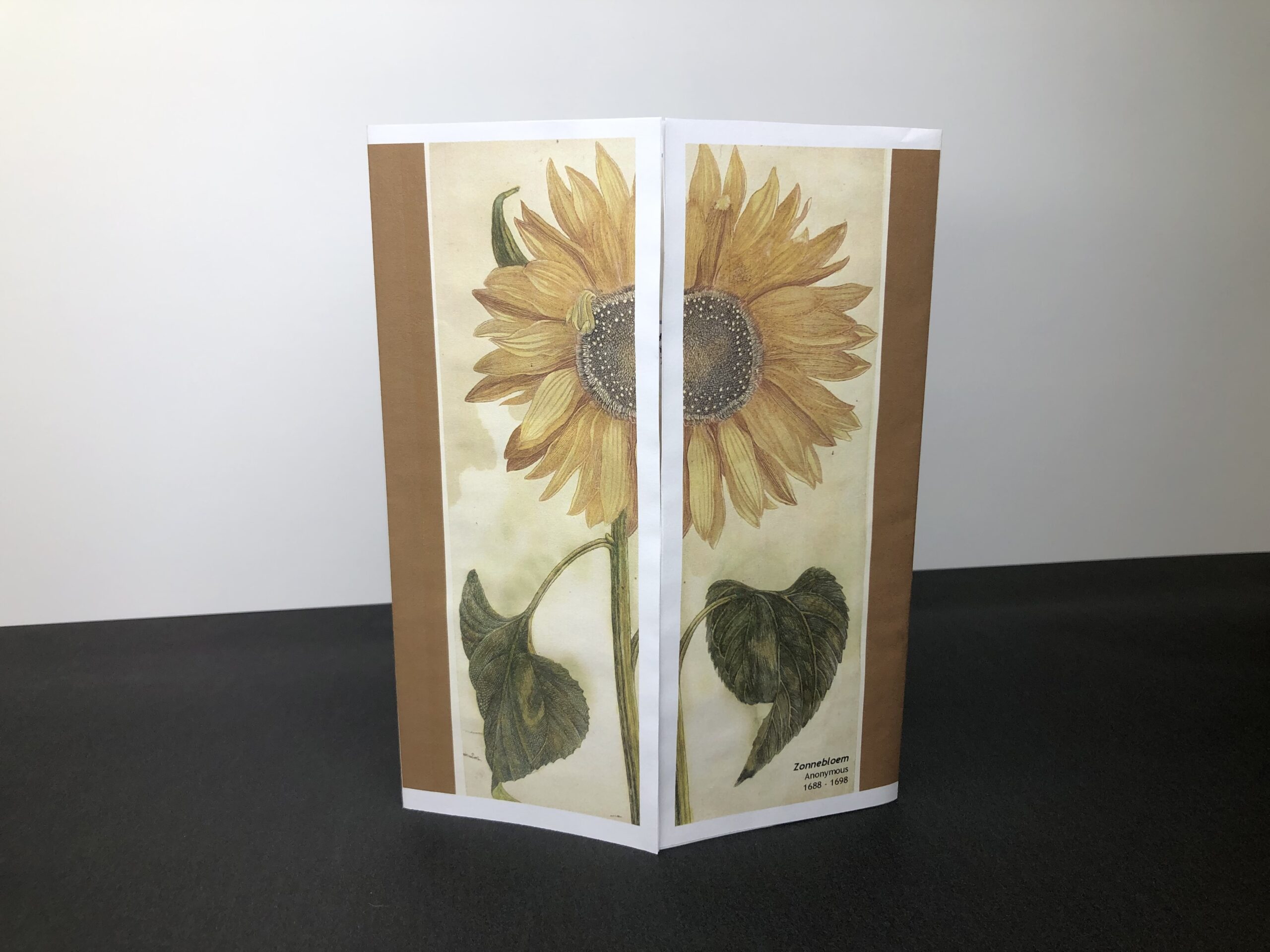
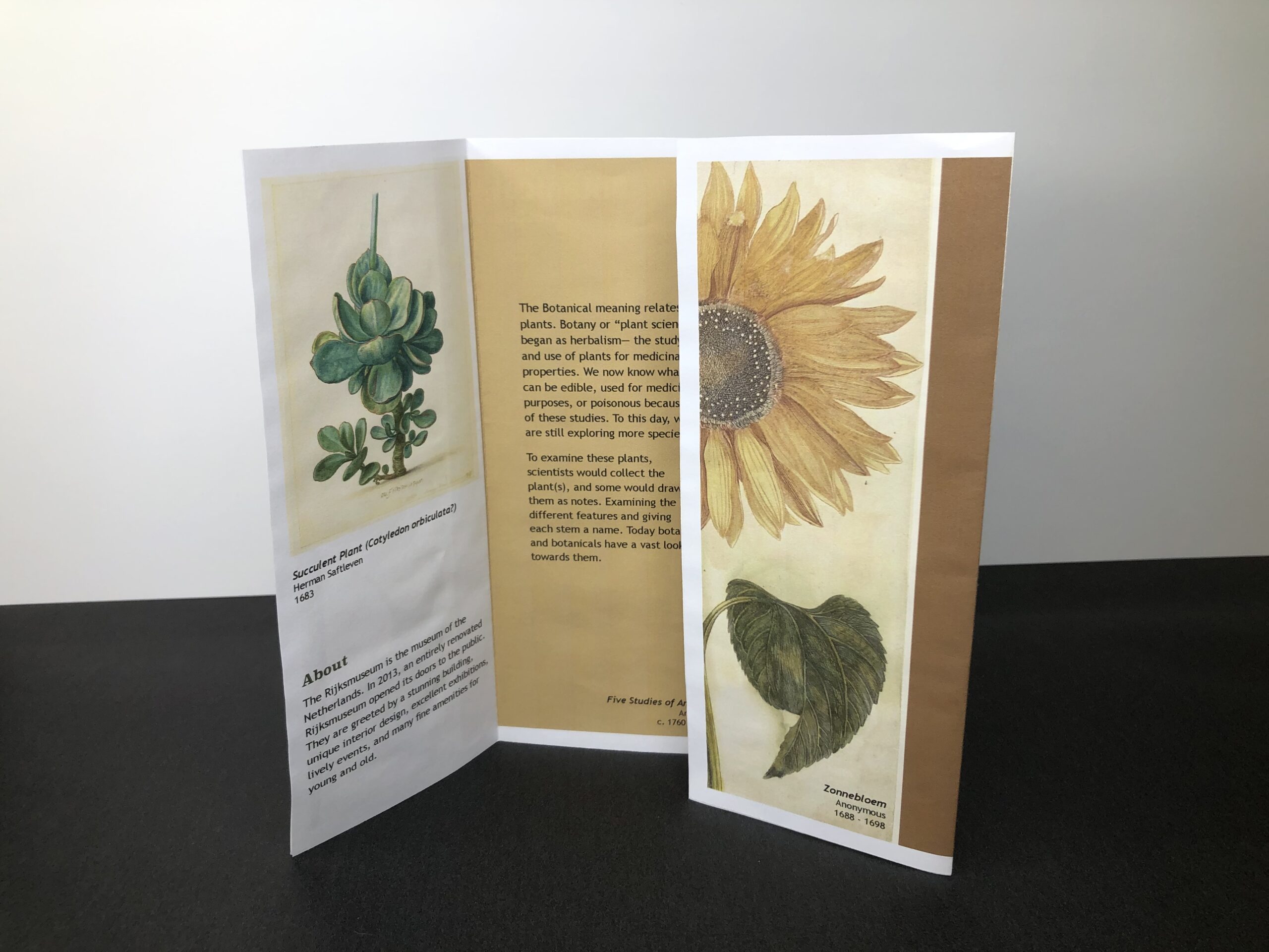
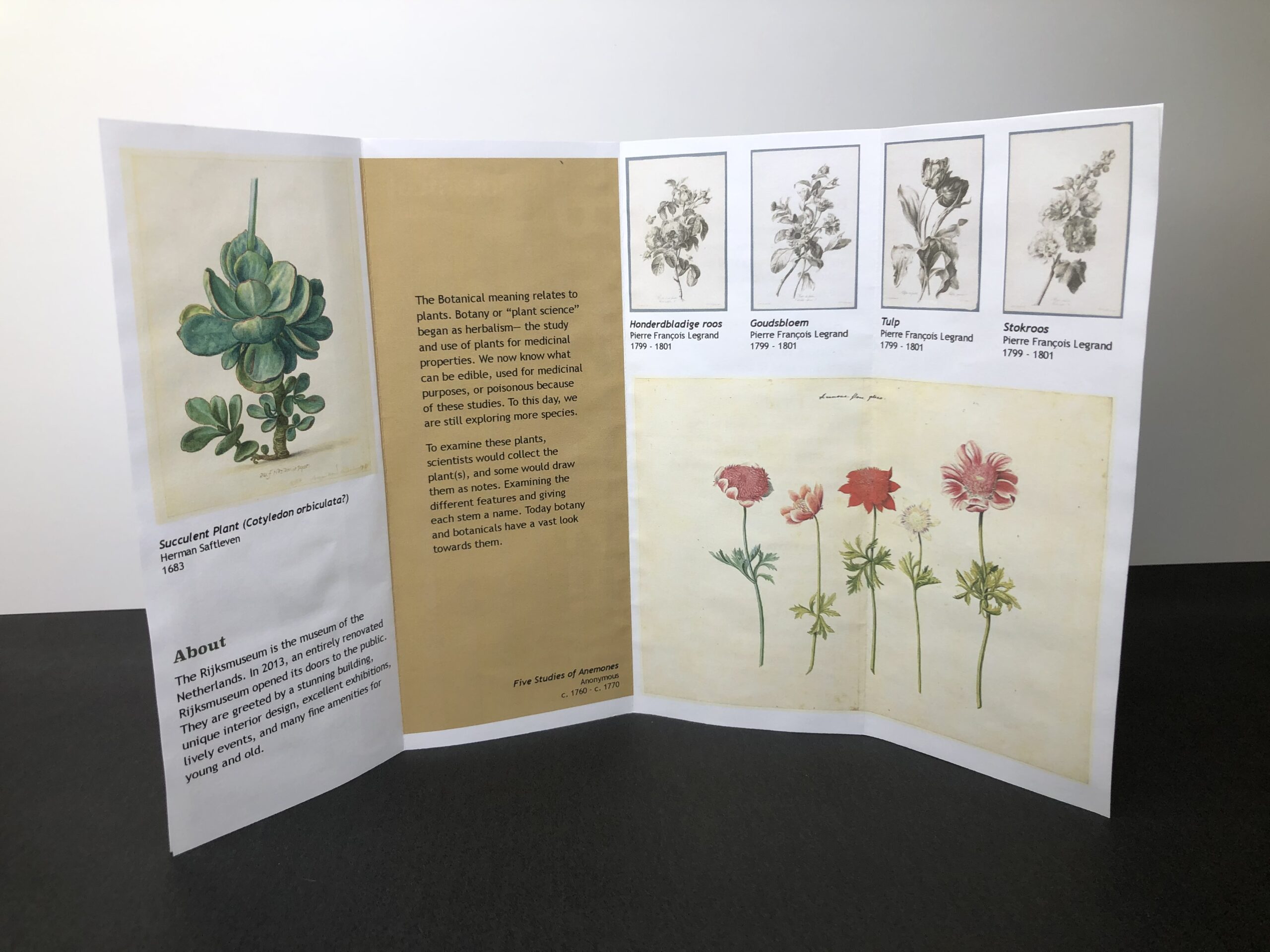
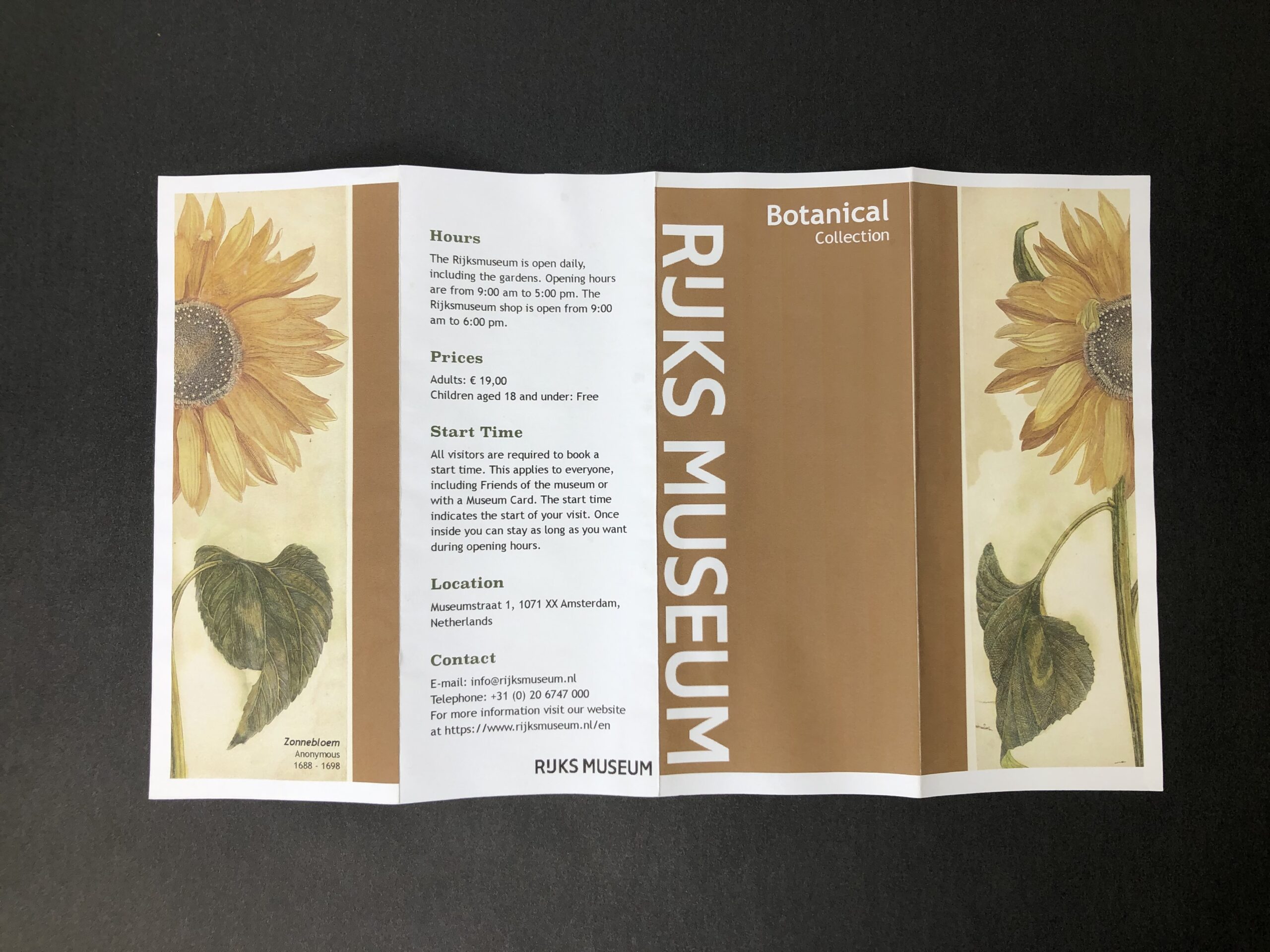
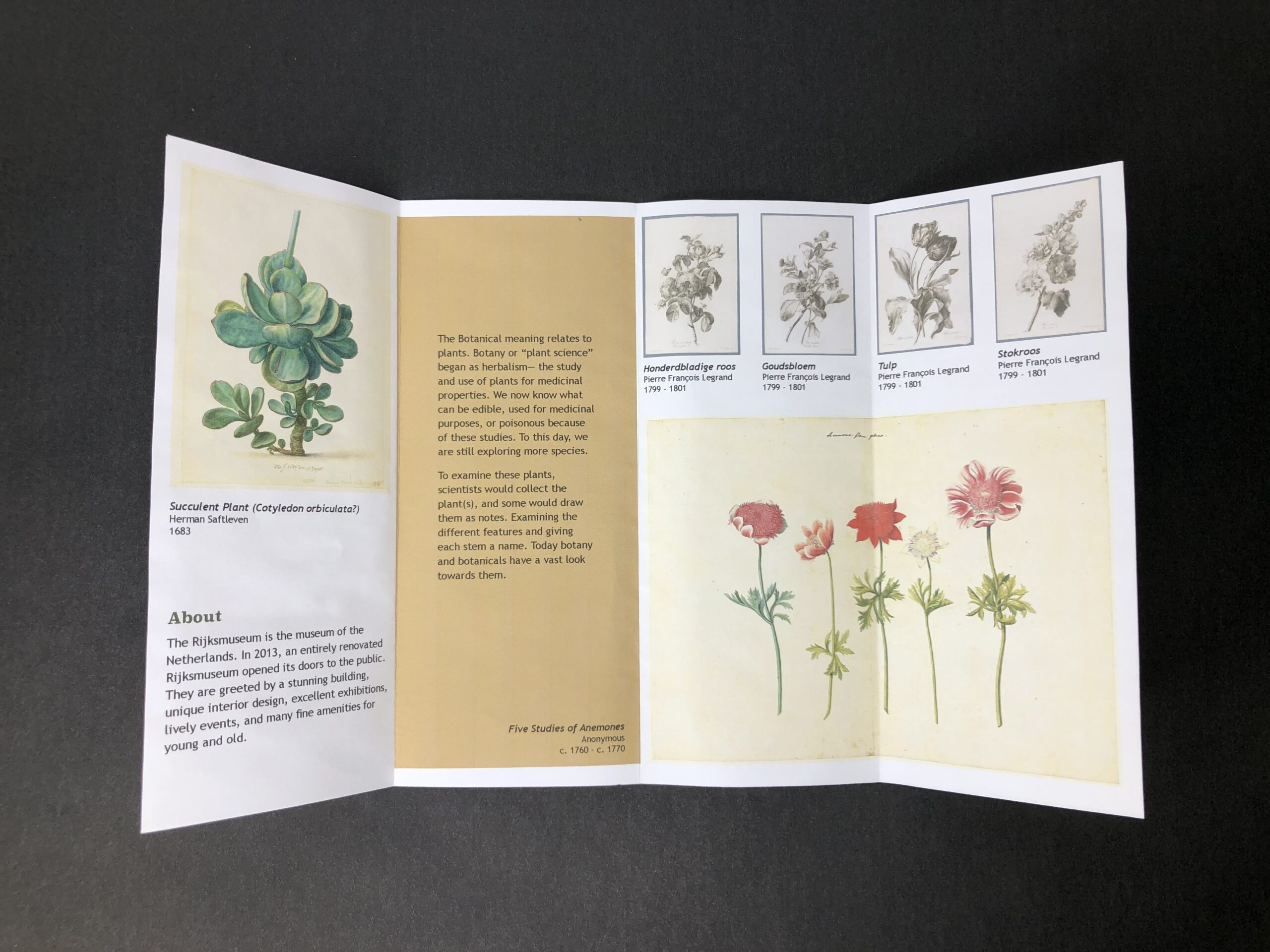
I created the brochures with the same style on the front panel–a solid color, Rijks Museum logo, the type of collection at the top–and throughout the brochure, I used only 2 fonts–one sans and another sans serif. I only used 2 fonts to keep the theme simple and text easy to read. I also made sure the color contrast is accessible with ADA for print and digital. While researching brochures, I was very drawn to ones containing images transitioning from one panel to the next which I applied at least once to each brochure. I also wanted to challenge myself by using a border for them.
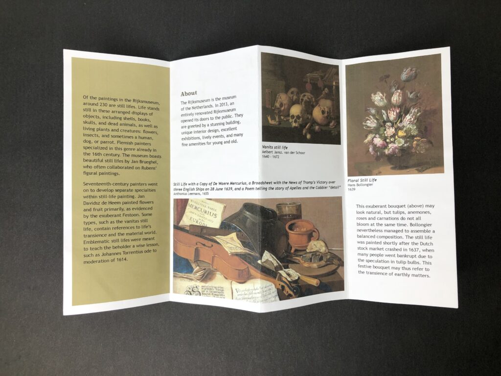
I always achieve for “less is more”. I believe an ideal brochure contains enough information to leave you wondering for more. Designing a brochure for an art museum, I would suggest to give enough photos of the art collection but not too much to leave the audience wanting more. Also, not to give too much written information about the collection. People come to see art and if they would like to know more about the collection or a specific piece, they have to journey to it in the museum themselves. It becomes an interactive experience with the brochure, the audience, and the museum.