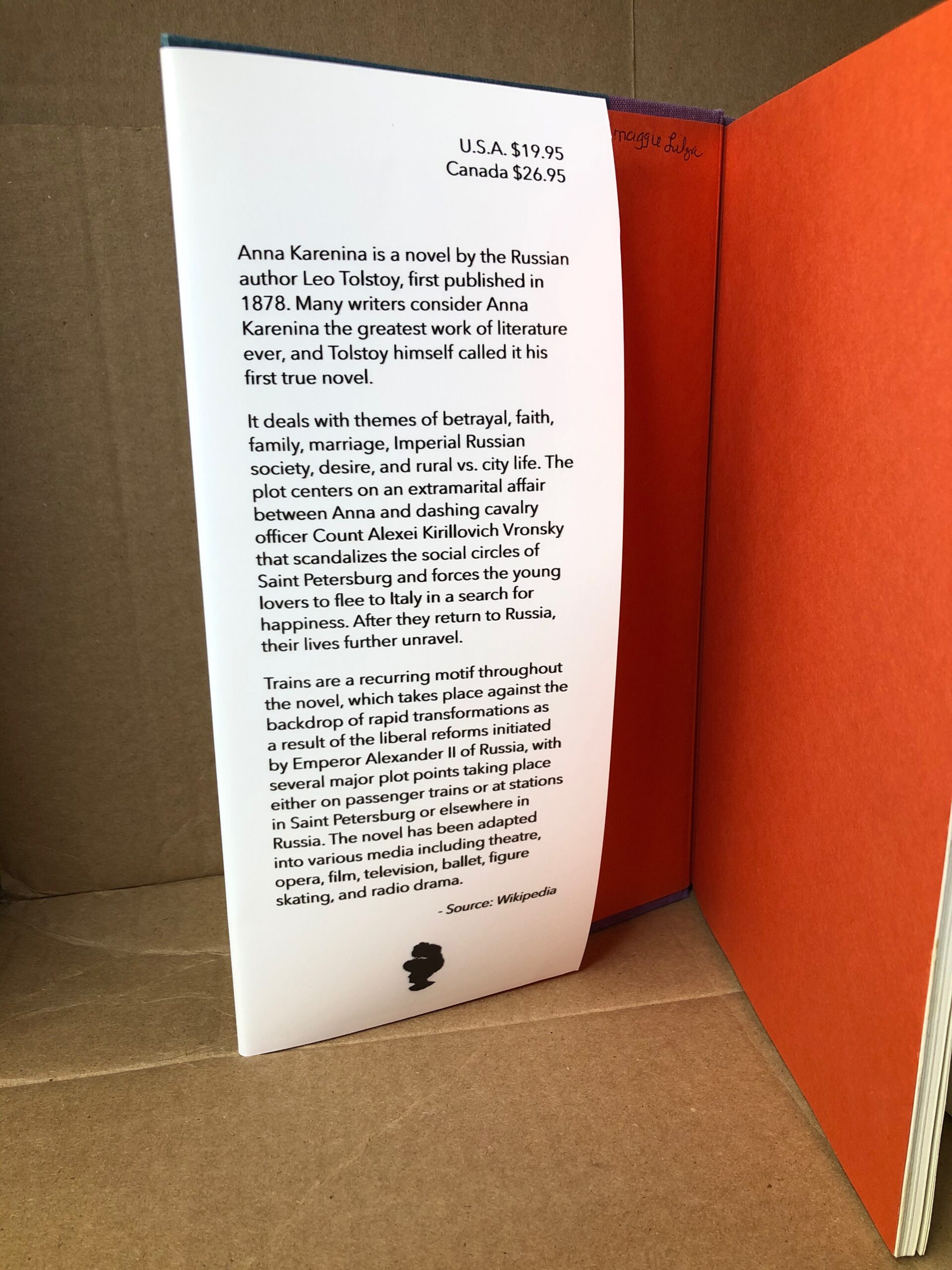
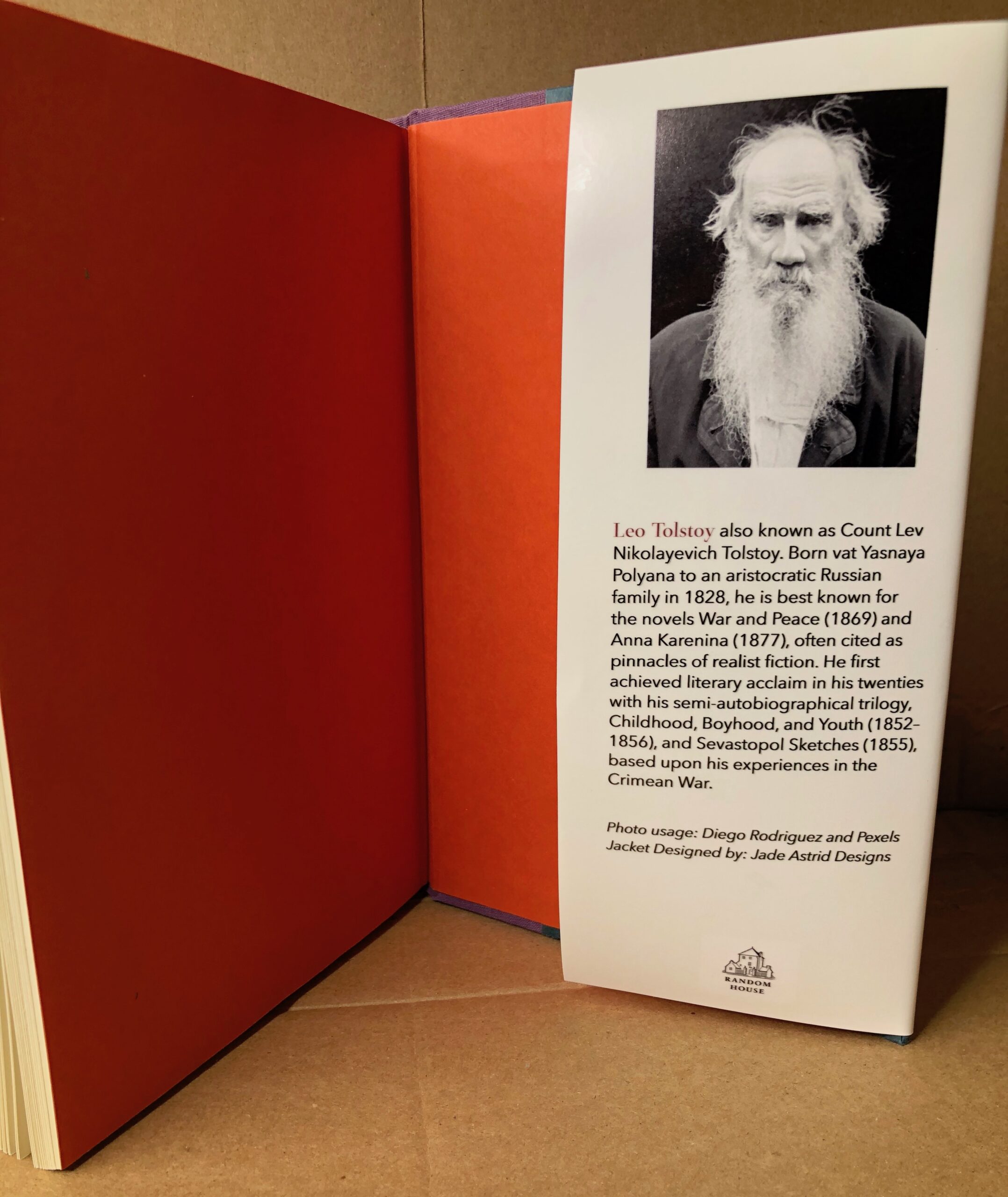
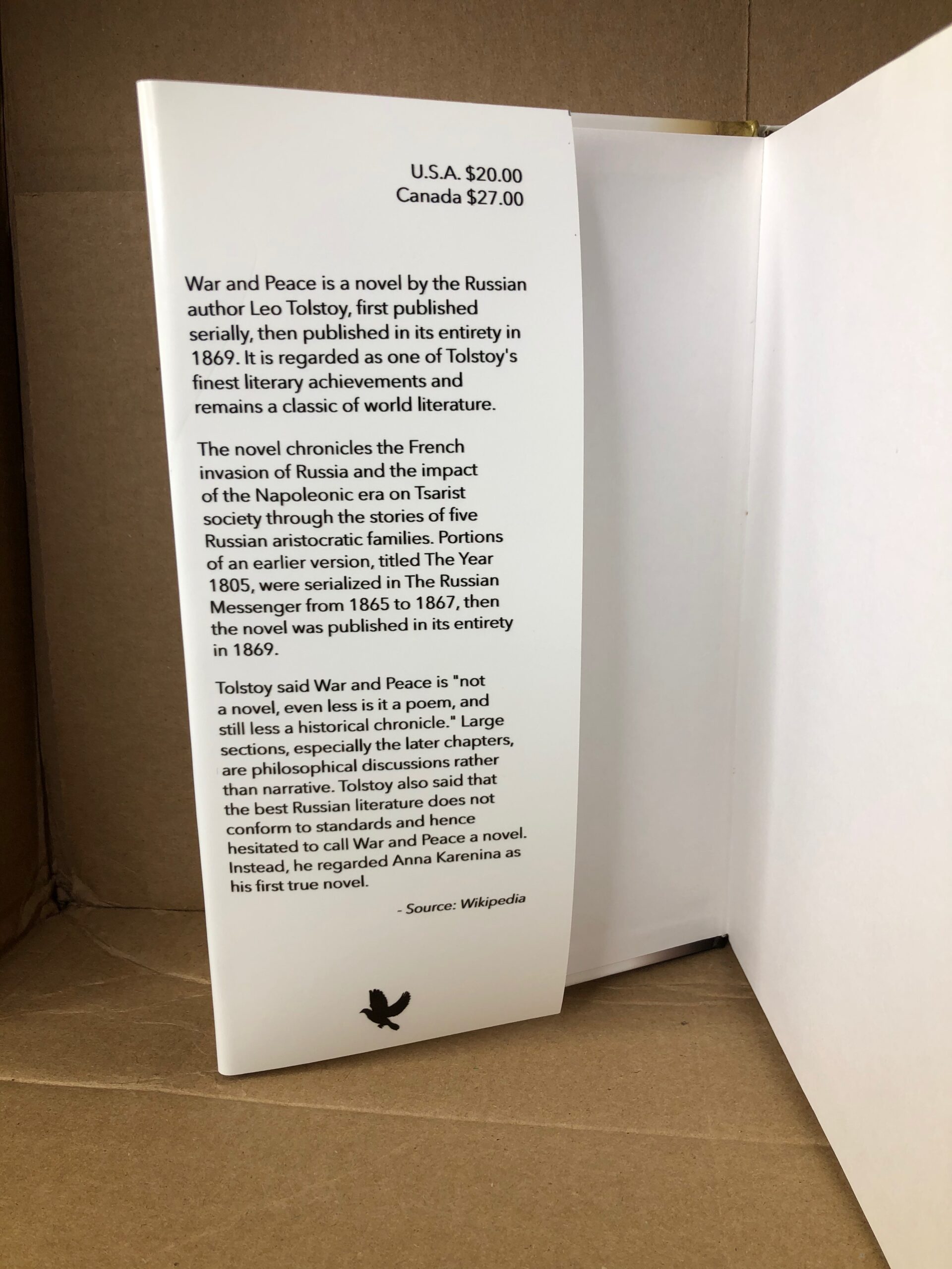
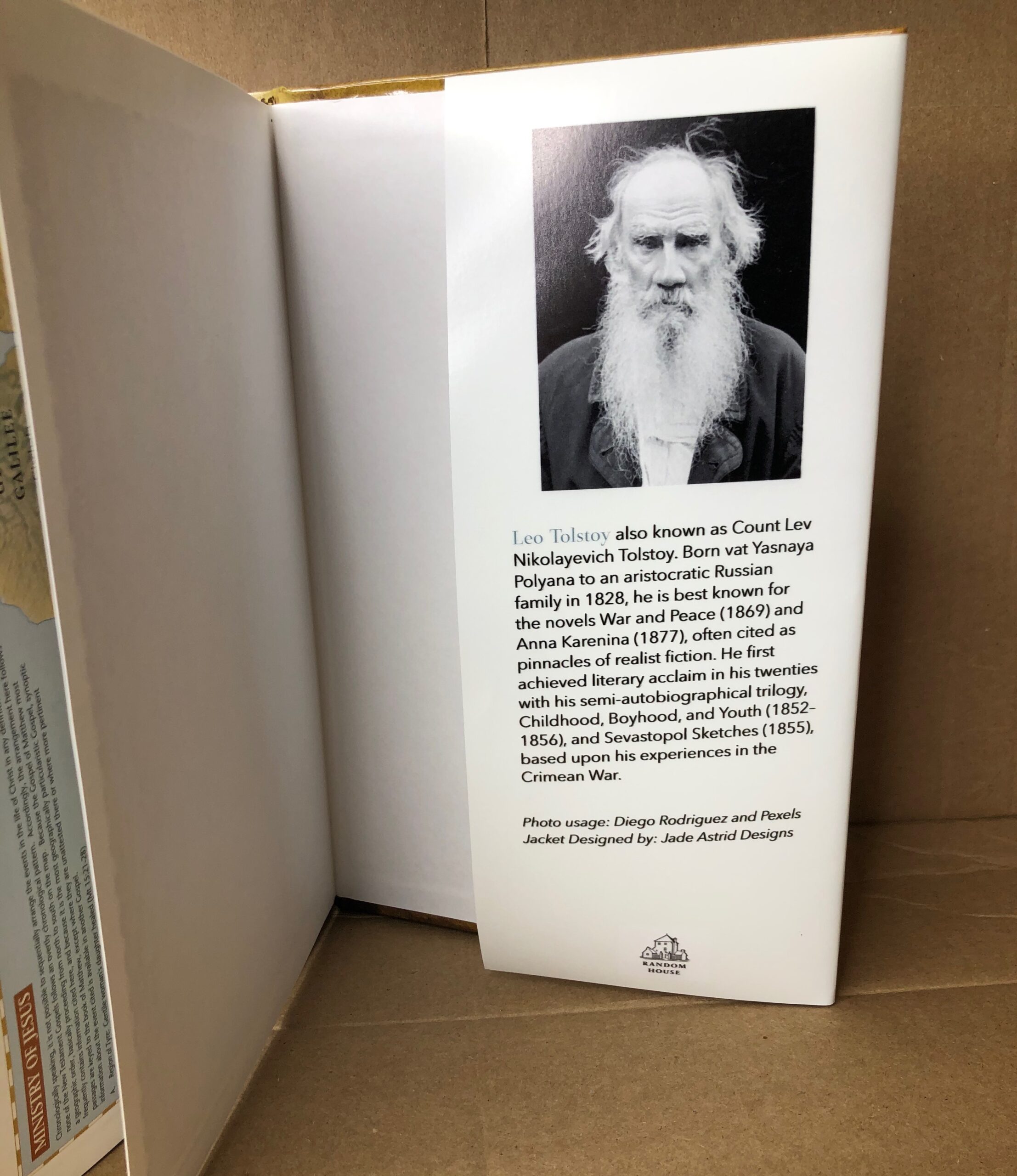
For the books, I wanted a simplistic and sophisticated look. I chose the colors red (maroon) and blue. They could have been reversed either way, but I chose maroon for Anna Karenina to represent the color of deceit/betrayal. I chose blue for War and Peace because blue represents peace. These two books are to work as a pair, their design is almost identical and only different with their main color, titles, and use of imagery. I got a little inspiration from Chip Kidd, most of his book jackets were simple but used images well to follow the story.
On the cover of Anna Karenina, the silhouette of a women with a red rose represents Anna even though the book has many characters and tells the story of each one, they all tie back to Anna. The train on the back cover represents the transportation and its importance in the book. As I was looking for symbols for deceit a red dahlia is one of its representative. The main character, Anna, also spoiler alert committed suicide towards the end of the book, so death came into play. With this I chose a red rose to represent the deceit and death that takes place in the book.
On the cover of War and Peace I looked for the symbols of war and peace. The symbol of war are two swords crossing one another and the symbol for peace is the dove and olive branch. I took those two into consideration and put it together. Using the olive branch as the other “sword” in the symbol for war. On the back cover I used the image of a horse, they were the main use for war during the 1800’s. On the inside flap I put a silhouette of a dove at the bottom as a decorative emblem.


